Skip to content

Walk into a new-car showroom today, and a lot of dashboards look like someone glued an iPad in the middle and then removed almost everything else. Fewer knobs, fewer switches, lots of glossy black plastic, and big tiles on a screen.
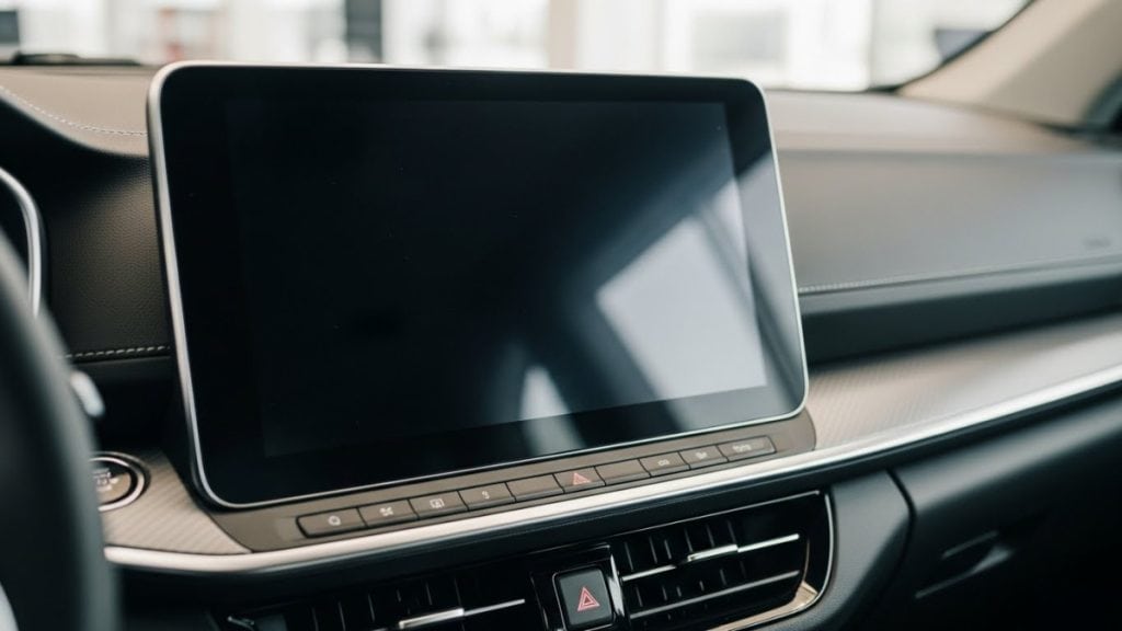
At the same time, when you actually talk to people who drive these cars every day, you keep hearing the same thing: “I just want a proper volume knob,” or “Why is the defrost buried in a menu?”
That tension is really what this whole debate comes down to:
- Everyday drivers, who want straightforward controls they can use without thinking.
- Designers and tech-focused buyers who love clean, minimalist interfaces and big displays.
Over the last few years, safety bodies and researchers have started weighing in too, and the conversation has shifted from “what looks cool” to “what actually keeps your eyes on the road.”
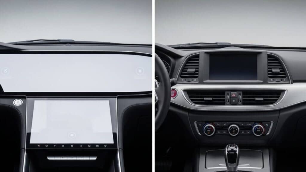
Let’s unpack how buttons and touchscreens compare in normal driving, what the safety data says, how this affects accessibility, what it costs manufacturers, and what carmakers are actually doing about it.
Usability & Ergonomics: How It Feels to Use Each One
Take two mental pictures.
On one side, a Tesla Model 3 or Model S: huge central touchscreen, very few traditional controls, many functions tucked into on-screen menus. On the other, something like a Honda Accord or a Mazda CX-50: a reasonable-sized screen, but real knobs and buttons for climate and audio living just below it.
They’re both modern cars, but ergonomically they behave very differently.
Tactile feedback and “find it by feel”
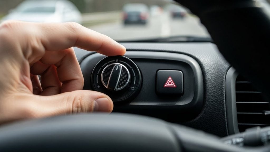
Physical buttons and knobs give you something your fingers can recognize. Knobs are round and have resistance; rocker switches have a little “click” or detent; hazard buttons are often raised and centered. After a week or two with a car, most people can reach out, feel roughly where things are, and adjust volume or temperature without taking their eyes off the road.
Touchscreens are intentionally flat. You can’t feel a volume slider or a small climate icon. To hit it accurately, you have to glance, aim your finger, and then often glance again to make sure it worked.
A well-known Swedish test by Vi Bilägare compared a dozen cars and found that simple tasks (like changing radio station or adjusting climate) took up to four times longer in the most touchscreen-heavy car than in an older Volvo filled with physical buttons. That’s a huge difference once you’re actually moving at motorway speeds.
Menu depth and mental effort
Touchscreens do have a genuine upside: flexibility. One panel can show navigation, media, apps, drive modes, energy use, suspension settings, and whatever else the manufacturer thinks is useful or marketable. You can add features with software updates without changing the hardware at all.
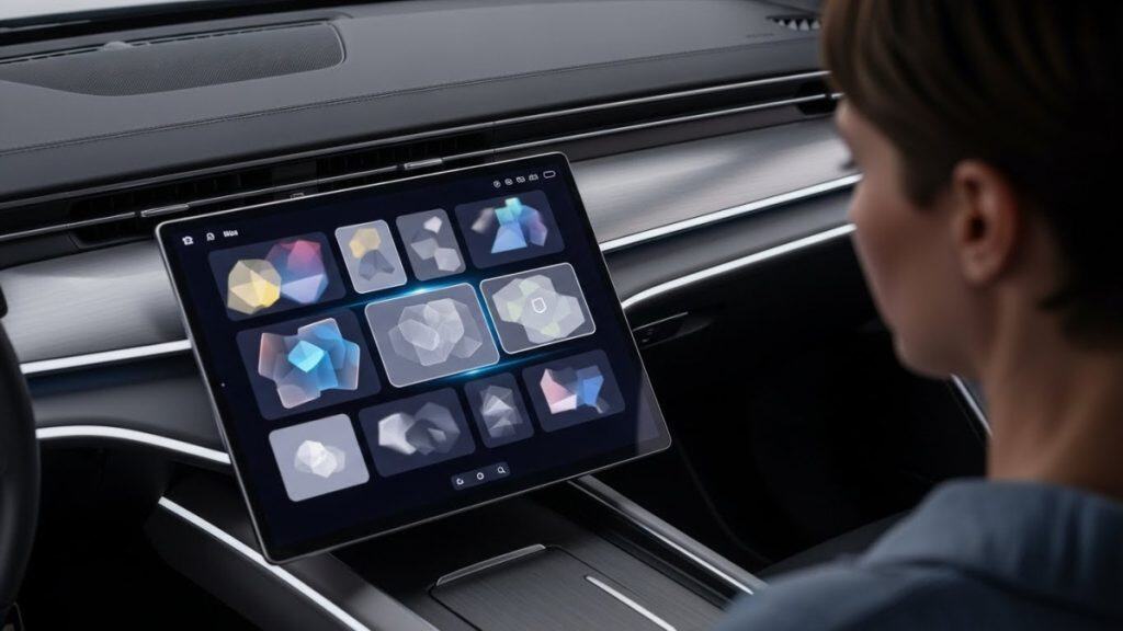
The problem is that flexibility tends to mean layers of menus. If changing the seat heater or adjusting the fan direction is a matter of:
- Tap “Climate”
- Tap a submenu
- Tap a small icon or slider
…then you’ve turned a one-step, eyes-up action into a mini interaction sequence. Your brain has to locate the right tile, interpret the layout, and sometimes deal with lag or tiny touch targets.
With physical controls, the mental model is simpler. “Big right-hand knob = temperature.” “This rocker = fan speed.” You learn the layout once, and then it stays put.
That’s essentially the ergonomic trade: touchscreens are powerful and configurable, but they demand more attention. Buttons are crude by comparison, but they’re predictable and forgiving.
Driver Distraction & Safety
This is where things get serious, because it’s not just about annoyance anymore.
Eyes-off-road time
Safety researchers care a lot about how long your eyes are away from the road. A couple of quick glances here and there is normal; long visual tasks are where the risk spikes.
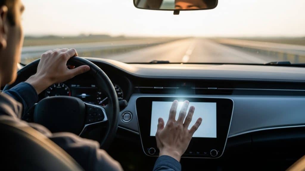
The European Transport Safety Council (ETSC) has summarized several studies on this. In one set of tests, drivers interacting with in-car touchscreens to do things like enter a navigation address or change music ended up looking at the screen for over 10 seconds in total for a single task; typing an address was around 15–16 seconds. That’s effectively driving blind in short bursts.
Other work comparing Apple CarPlay and Android Auto to baseline driving has shown reaction times slowing down to a level similar to, or worse than, driving over the legal alcohol limit. The common thread isn’t the brand; it’s the fact that you’re doing a visual-manual task while moving.
With good physical controls, a lot of that never happens. You don’t stare at the temperature dial; you just reach for it, feel the shape, and twist. Steering-wheel buttons for volume or track skip are the same way. Your eyes stay mostly up.
Why regulators suddenly care about buttons again
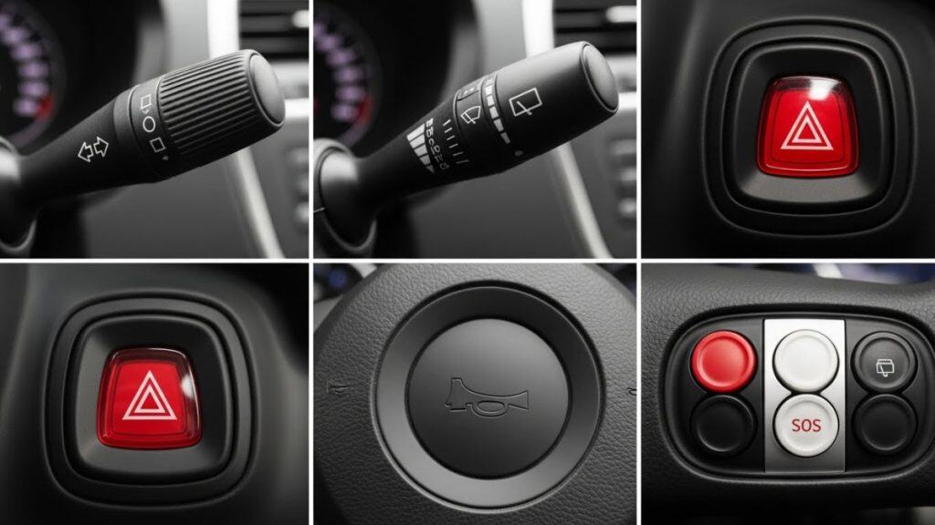
Euro NCAP, the major European crash-test and safety-rating program, has effectively decided the industry went too far. From 2026 onward, if a car wants a full 5-star rating, it will need physical controls—buttons, stalks, or switches—for core functions like:
- Turn signals
- Hazard lights
- Horn
- Windshield wipers
- Emergency eCall/SOS
If those live only inside a touchscreen, the car gets marked down. The logic is simple: in an emergency, you should not be hunting through a screen to find the hazard button or trying to swipe for a wiper menu in heavy rain.
In the US, the rules are softer. NHTSA’s Driver Distraction Guidelines are voluntary, but they recommend that in-motion visual-manual tasks stay very short and limited in complexity, and they treat conventional knobs and stalks as part of normal driving. Still, as more data comes in, it’s hard to imagine regulators quietly ignoring any clear pattern of crashes linked to bad interface design.
Accessibility & Inclusivity
Touchscreens also behave very differently for drivers who don’t match the “perfect conditions” scenario in a brochure.
Gloves, weather, and glare
Try operating a capacitive screen with thick winter gloves on. Some car displays will register your press; many will not, or they’ll require awkward pressure and precision. Add frost, bright low-angle sun, or fingerprints, and suddenly basic adjustments feel like phone troubleshooting instead of driving.
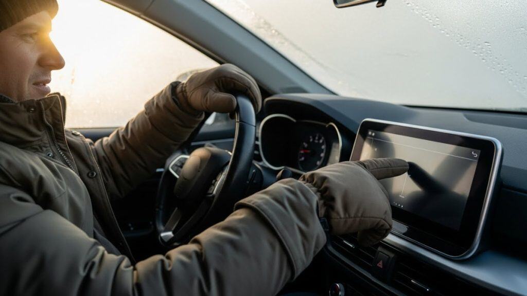
Physical switches don’t really care what season it is. If you can physically move the knob or press the button, the system responds. In places with harsh winters, that’s more than just convenience; it can be the difference between comfortably running the defroster and getting frustrated enough to keep poking at a screen instead of watching the road.
Drivers with low vision or limited dexterity
For drivers with reduced vision, depth perception issues, or conditions that affect fine motor control, flat glass panels are even more challenging.
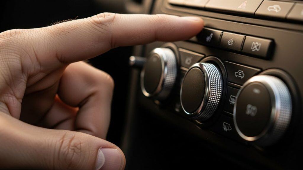
A temperature dial with a raised edge and a fixed position is something you can learn by feel. A distinctive hazard button near the center stack becomes part of your mental map of the car. But when everything is visual and dynamic—icons that change with software updates, small touch points, sliding gestures—the interface becomes much less forgiving.
From an accessibility point of view, keeping analog controls for the most important functions is one of the simplest, cheapest improvements a carmaker can make.
Voice control and AI helpers
To soften the dependence on screens, some brands are leaning heavily into voice and AI. Mercedes has its “Hey Mercedes” assistant; BMW’s new systems use an Alexa-based backend; other brands are experimenting with ChatGPT-like assistants for natural language commands.
That does help in a lot of scenarios—asking for a route, adjusting temperature, calling someone—especially when your hands are busy. But voice recognition is still imperfect, and some drivers simply don’t like talking to their car. Background noise, accents, kids yelling in the back seat… it all adds friction.
Most safety experts land on a layered approach: let voice and automation handle complex or infrequent tasks, keep screens for rich information like maps, but never remove tactile fallbacks for the essentials.
Cost, Manufacturing, and Long-Term Ownership
So if buttons are so good, why did carmakers rip so many of them out in the first place?
A big part of the answer is cost and complexity—on their side, not yours.
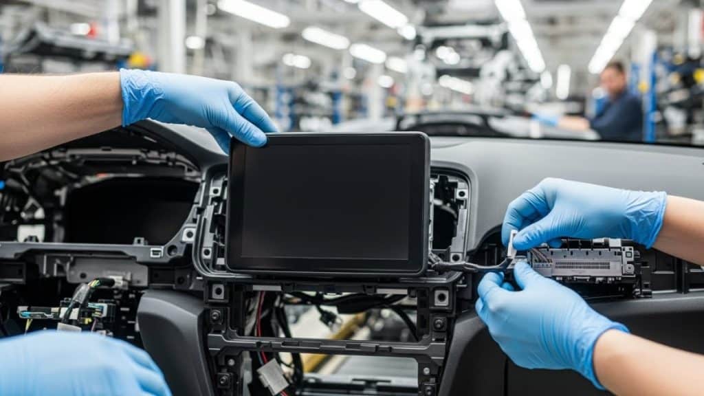
Every physical knob or switch is a component: plastic parts, a mechanism, a circuit, wiring, assembly time. When you multiply that across a whole dashboard, the bill of materials and build complexity add up. A single unified display plus a few multifunction controls can be cheaper to produce and easier to reconfigure across trim levels. Analysts and industry commentary have been very blunt about this: it’s often “less costly to manufacture a car without buttons and switches.”
Touchscreens also let manufacturers fix bugs and add features with software updates, which is attractive from a product-planning standpoint. You can push out a new interface or extra functions years after launch. You can’t do that with a mechanical temperature slider.
From an owner’s perspective, though, the story is a bit different:
- A single failed knob normally affects one function and can often be replaced cheaply.
- A dead or cracked central display can knock out climate control, media, driving modes, cameras, and more in one shot—and the replacement cost can be very high once the car is out of warranty.
You’re trading parts count for integration. When it works, it feels slick. When it fails, it hurts.
How Automakers Are Responding
The industry is in a weird half-step moment right now.
The minimalist, screen-first camp
Tesla is still the most extreme example: very few conventional buttons, heavy reliance on the central screen and a couple of thumb-wheels on the steering wheel. That approach influenced a lot of newer EV brands like Rivian and some Chinese startups, which chased the same “living room on wheels” look.
BMW, historically famous for its iDrive rotary controller, is now phasing that knob out in some upcoming models, pushing drivers toward a big curved display and voice instead.
These brands argue that:
- Software can evolve and get smarter over the car’s life.
- Voice and automation will reduce the need for direct touch interaction.
- A clean, screen-heavy cabin feels modern and sells well.
The backlash: bringing the buttons back
At the same time, there’s been a pretty loud backlash from both drivers and testers.
Volkswagen, which went all-in on touch sliders and capacitive controls in its recent models, has publicly called that direction “a mistake” and has started putting real buttons and knobs back into revised Golfs, Tiguans, and ID-series EVs. Their design chief has been quoted saying, in effect, “cars are not smartphones,” which is a neat way to summarize the mood.
Euro NCAP’s 2026 rules have only reinforced this pivot: if you lose stars for hiding basic controls on a screen, management starts to pay attention very quickly.
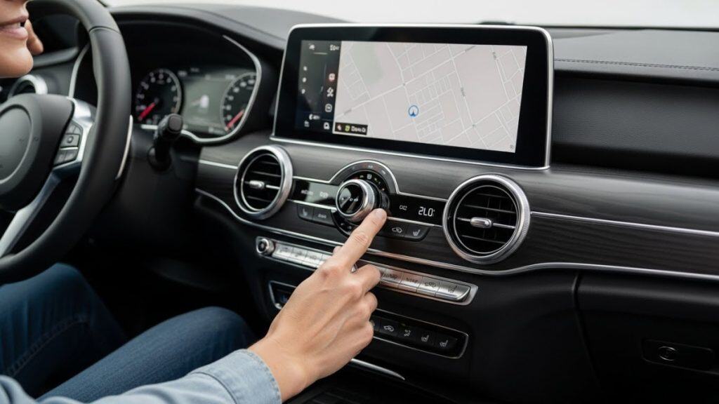
Mazda mostly never left. Recent models like the CX-50 still have physical climate controls and, in many trims, a rotary knob driving a non-touch main display at speed. Their philosophy is pretty explicit: fewer on-the-move touch interactions, more straightforward physical inputs.
Even Tesla has quietly retreated a little. After removing the turn-signal stalk on the refreshed Model 3 “Highland” and moving signaling to steering-wheel buttons, the company has now brought a stalk back for new Model 3s in China and sells a retrofit kit for existing owners in some markets. People complained, loudly, and the brand adjusted.
Put simply: the design pendulum swung very hard toward “screen everything,” and now it’s starting to swing back toward a more balanced layout.
What Drivers and Experts Actually Prefer
Surveys tend to tell the same story, no matter who runs them.
A 2025 Wired report, summarizing a UK poll of more than a thousand drivers, noted that around 89% preferred physical buttons for core tasks over touchscreen-only solutions. Other smaller surveys, like those reported by automotive blogs such as Muncly, show similar patterns: a majority of drivers, including plenty of younger ones, say they find buttons easier and less distracting for everyday use.
Safety experts and interface designers are, if anything, more blunt. Euro NCAP officials have called the overuse of touchscreens “an industry-wide problem,” and usability specialists have been pointing out for years that physical controls have “perceptible and actionable qualities” that flat screens simply can’t match.
You don’t need to know the exact quotes to get the gist: lots of people like the look of a big screen, but when you ask what they actually want to touch at 70 mph in the rain, the answer is: “a real button that does one thing.”
DIY Fixes and Workarounds
Plenty of owners aren’t waiting for the industry to fully course-correct.
Tesla drivers in particular have been creative: there are now official retrofit kits in some markets to add back a turn-signal stalk, and a cottage industry of aftermarket “stalk” and button solutions has sprung up for screen-heavy cars.
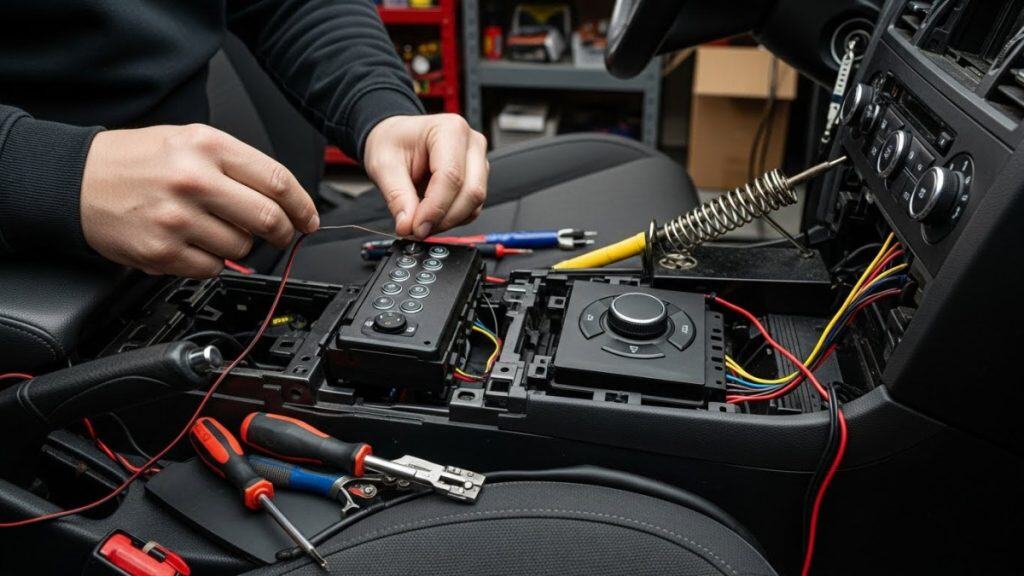
On the hacker side, projects featured on sites like Hackaday show people grafting original factory button panels onto modern head units, using microcontrollers to translate old-school button presses into commands that a touchscreen stereo understands. It’s a very nerdy way of saying, “I want my knobs back, but I’ll keep the new features too.”
Most drivers won’t go that far, of course. But even simple habits—mapping your most-used functions to steering-wheel buttons, using voice for navigation, or choosing cars that still have dedicated knobs—can significantly cut down how often you need to poke at a screen on the move.
So What Should You Look For?
If you’re shopping for a car and all of this feels a bit abstract, here’s a simple way to ground it.
On your test drive, ignore the marketing talk for a minute and just try doing real tasks while moving, like:
- Turning the heater up and down
- Switching on rear defrost
- Changing the radio station or skipping a track
- Adjusting fan speed
Notice how much time your eyes spend on the road versus on the screen. If you find yourself “typing” at a glass panel for more than a second or two every time you want a basic function, that’s a red flag.
Touchscreens are not going away, and they are genuinely good at certain things—maps, cameras, detailed settings. But the evidence is pretty clear that for frequent and safety-critical actions, having a physical button, stalk, or dial still makes driving simpler, safer, and less stressful.
The best future is probably not one extreme or the other, but a mix:
- Smart screens and voice for deep, occasional tasks.
- Honest, tactile controls for the things you reach for every single day.
If you can, choose cars that already reflect that balance. And if your current car is more “tablet than dashboard,” at least be aware of how you’re using it and limit those longer, fiddly interactions to when you’re safely stopped.
Related Resources
- https://etsc.eu/physical-buttons-outperform-touchscreens-in-new-cars/
- https://etsc.eu/cars-will-need-buttons-not-just-touchscreens-to-get-a-5-star-euro-ncap-safety-rating/
- https://etsc.eu/new-warning-on-infotainment-screen-distraction/
- https://www.euroncap.com/en/for-engineers/protocols/2026-protocols
- https://www.wired.com/story/why-car-brands-are-finally-switching-back-to-buttons
- https://muncly.com/physical-buttons-vs-touchscreens/
- https://www.vibilagare.se/english/physical-buttons-outperform-touchscreens-new-cars-test-finds
- https://insideevs.com/news/769401/tesla-turn-signal-stalk-model-3